Hey everyone! If you've been keeping up with the blog, you may remember that my solo show at the Modern Eden Gallery is coming up soon. Along with what I've done with the Natural Patterns series I am also working on this series to show with each other.
Process and concept
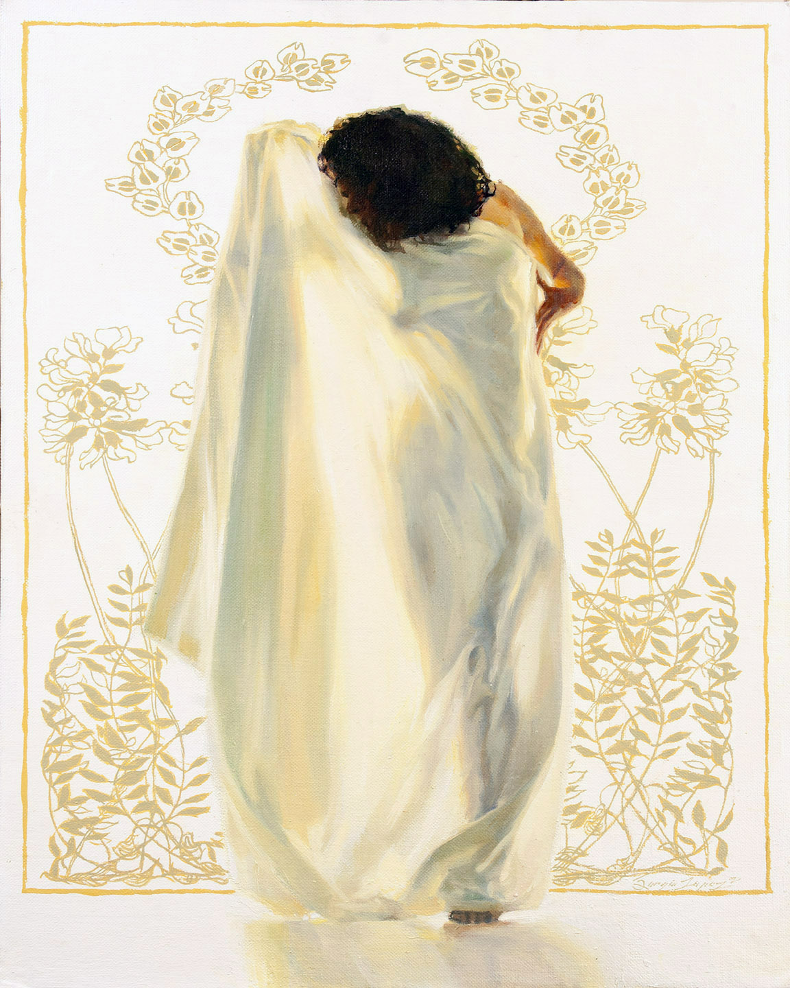
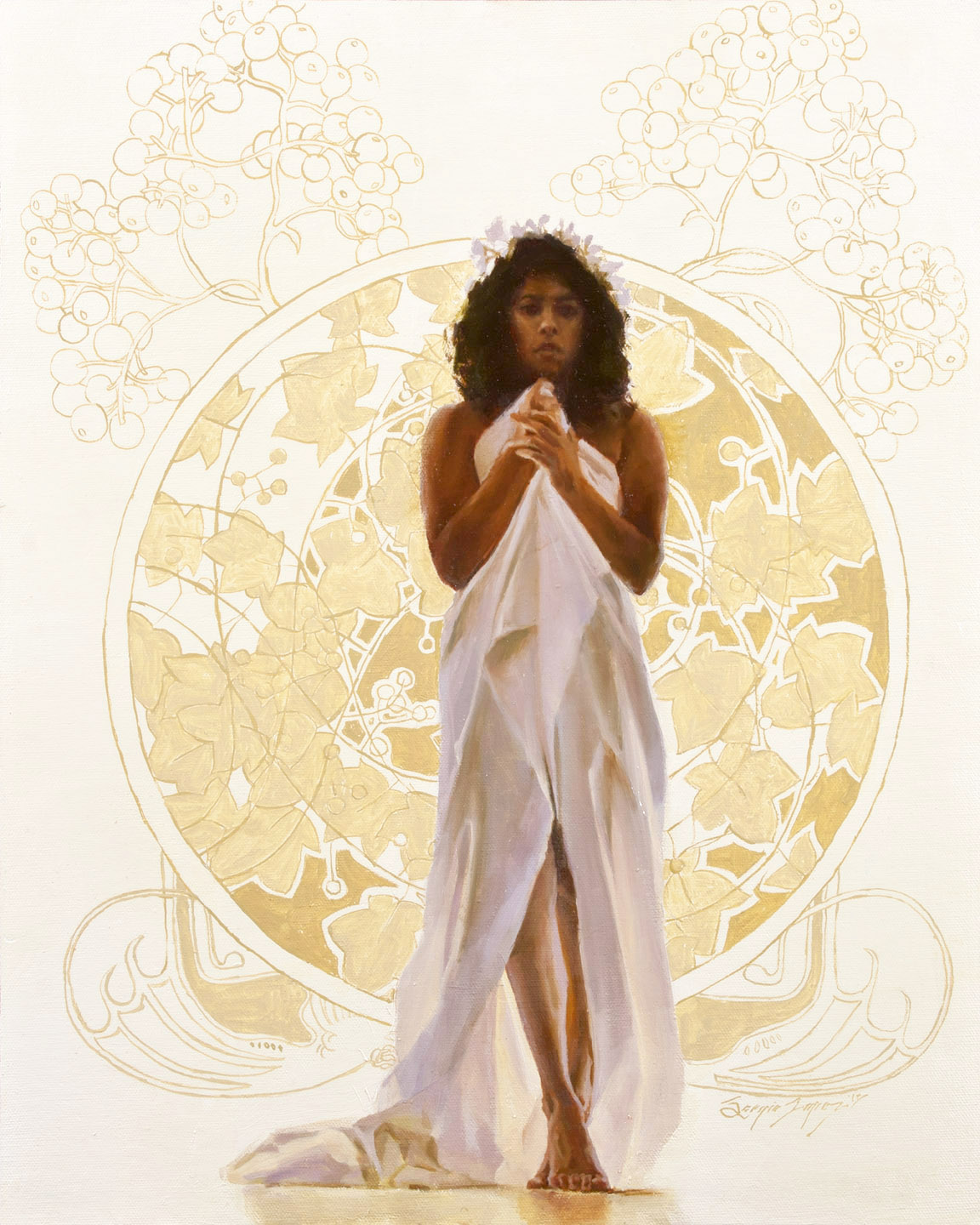
This model posed for me in front of a large window surrounded by natural light reflected from multiple angles. It makes this really interesting diffused back lighting. I pretty much improvised the flower head-dress for her to model with. As I went through the photos for the shoot, I cherry-picked the ones that would make the best compositions.
I wasn't quite satisfied with just the figure against such a minimal background as a concept, so I wanted some sort of interesting decoration around her. An Art Nouveau motif seemed like a good fit for her costume, and I had happened to come across the Jugendstil magazine Ver Sacrum, a short-lived yet highly influential periodical created by the likes of Gustav Klimt amongst other greatly skilled designers. I love design from that period, and I wanted to create something that pays homage to the influence yet bringing my own style to it.
As I was coming up with the names for these, I wanted to know what Ver Sacrum actually referred to. It's actually Latin for Sacred Spring, which is an ancient Roman ritual. A lot of the mythology tied to it seemed pretty interesting to me. The names have varying degrees of meaning tied directly to it, but I have fun playing with the words to make them into something mysterious.
"Sabina" 16x20 in. oil on canvas board.

"Samnia" 16x20 in. oil on canvas board.

"Aquila" 16x20 in. oil on canvas board.
"Evocation" 16x20 in. oil on canvas board.

"Votum" 16x20 in. oil on canvas board.
These smaller pieces were done on watercolor paper mounted to board with water-mixable oils. I'm still having fun with them. The main issue I've had with them is that the white paint is way too transparent for me. Apparently you can mix gouache into the Holbein Duo paints, at least that's what I've read. I might need to do that, at least for the oils.


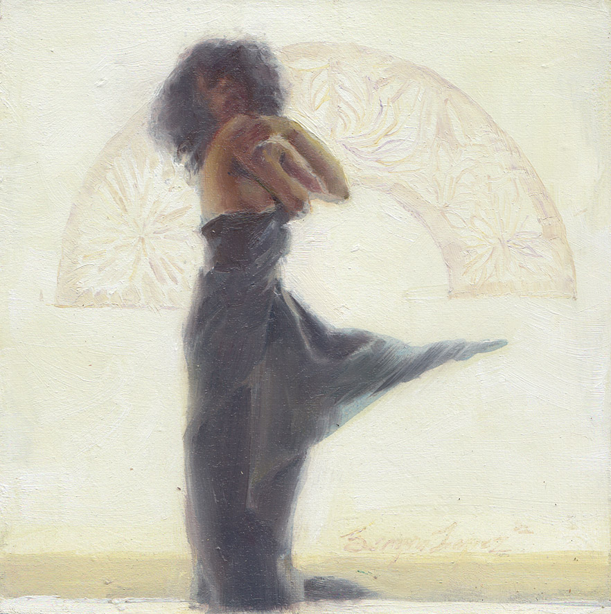
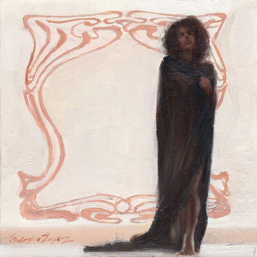


Speaking of transparent whites, I posted this on Facebook as well, but I am really liking Transparent White as a color to lighten other mixtures. It doesn't overpower the other colors like Titanium White would, it gives you much more control if you just want to step up the values a bit. Hope that's a good tip for some of you out there.
•
Newsletter
Tumblr
Drawings For Sale
Prints For Sale
Google+
0 comments:
Post a Comment